NatWest & RBS
Creating application forms with empathy
TLDR
Putting users first increased business
Understanding the Problem
RBS were looking to move away from legacy systems, introducing a faster and safer way to apply for a credit card online. The bank had teams working on similar journeys for current account and loan applications. These teams worked together as part of a wider collective to ensure that any cross over was consistent and the design stayed true to the design system that was in place. This was to allow for a component build approach and keep the development teams from re-working similar problems.
The stakeholders had analytical data for the old journey and we used this as our basis to test why drop out rates were the way they were. We ran sessions on these journeys, inviting users in to test them on mobile, tablet and desktop devices and from these sessions we understood that the problem wasn't what the stakeholders had assumed they were from the analytics. Upon presenting our findings we had to try and introduce a user centric mindset to the stakeholders and change their way of thinking as everything was approached from a business and numbers perspective without understanding the thought processes a user went through while applying.
From the research sessions we understood what tripped users up, how the language was confusing, the reasons why they'd apply for one of these products and what other factors impacted the user whilst applying. What was very interesting was that while users knew what a credit check was, they didn't know at what point of the journey a credit check would be performed or the impact it would have on their record.
Our role
On this project I was the lead UX Designer on the credit card applications journeys. I worked alongside a UX writer and a service designer whilst collaborating with journey managers and other stakeholders.
The services that I performed were to work with the stakeholders to understand both what they thought the problems were and what other issues the current journey had. I worked with the technical team to understand the systems involved in the application process and how the application forms interacted with the back end. This work allowed me to produce user journey maps and create prototypes for testing. I lead research efforts and collaborated with a UX researcher to run testing sessions with users on old and new journeys across different platforms.
During build I would work with the developers to ensure that the UI was pixel perfect and perform responsive design testing across several devices.
Design
The bank had a design system in place with a Sketch component library produced to ensure consistency across the online applications. This meant that the visual assets such as text field inputs, select drop downs, radio buttons etc with different interaction states were available to us and the rules in terms of layouts, grid systems and responsive variations were in place for consistency.
This allowed us to iterate the pages and sections in a more efficient manner, keeping the stakeholders updated with progress and giving them access to click through prototypes for their impressions and feedback.
Part of the remit of being in the team was to always look for ways to improve the system and the component library based on the findings of the research.
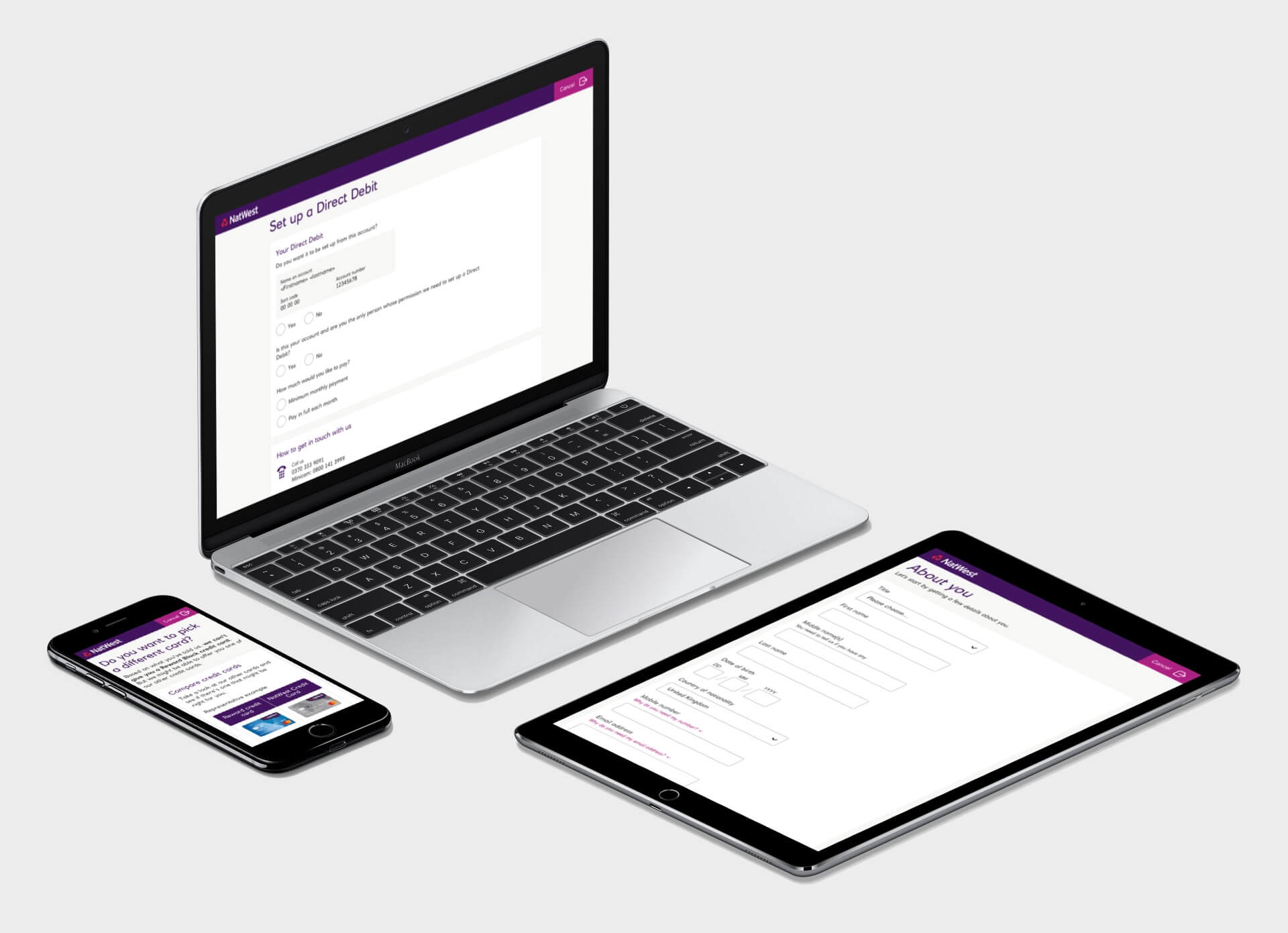
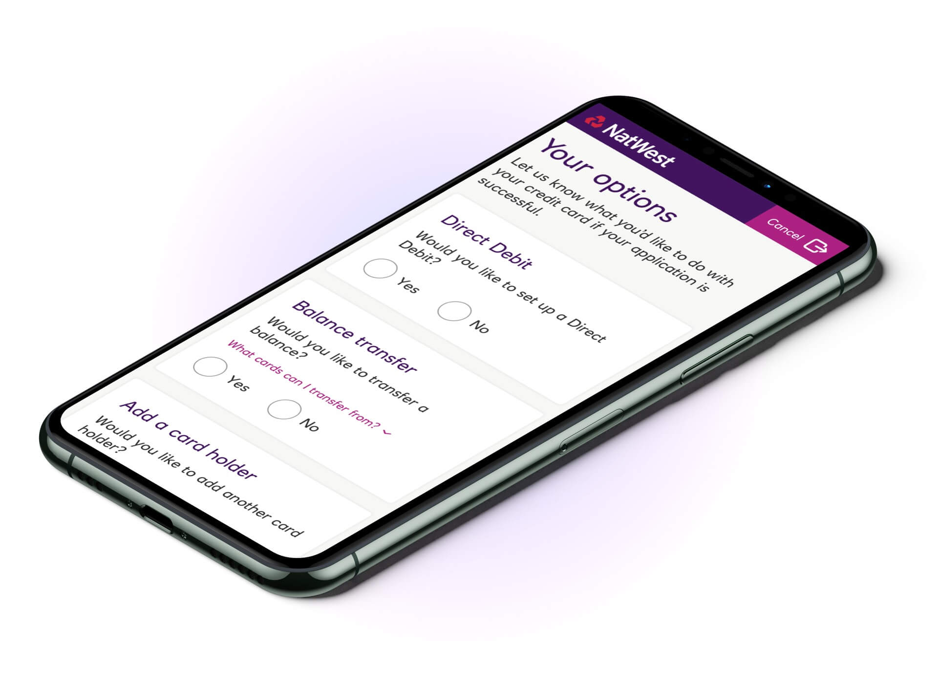
A Modular Journey
The old journey forced users through a path to set up options that they may not need and from the testing we could see that this was a pain point for people.
What I proposed was introducing an opt-in modular journey. This meant taking the Direct Debit set up, the Balance Transfer and Add a Card Holder sections and giving the user the option of setting up the features they wanted during the application process. This was well received when tested later.
Implementation
We worked in an agile environment, scoping and sizing what pages and sections could take more time and effort based on the research and discovery work that had taken place. To allow us to iterate on what mattered most, we focused on the areas of the journey that were exclusive to the credit card applications and have the generic pages tied in to the journey later in the project.
Visuals for the journey were shared using Zeplin and I provided annotated mobile, tablet and desktop based screens with an accompanying InVision prototype for reference.
Iteration
Whilst our focus was on the credit card focused application pages, we were still keen to test the end to end journey and how the generic application pages worked for the customer base. During testing sessions I witnessed that some of the design patterns that had been designed and implemented previously were becoming a pain point for users.
One particular component that we saw as a regular pain point was entering a middle name. From what we witnessed, users that were keyboard based would regularly tab into the middle name field and enter their surname. Some caught what they were doing, others had to go back from the last name field to the middle name field and amend.
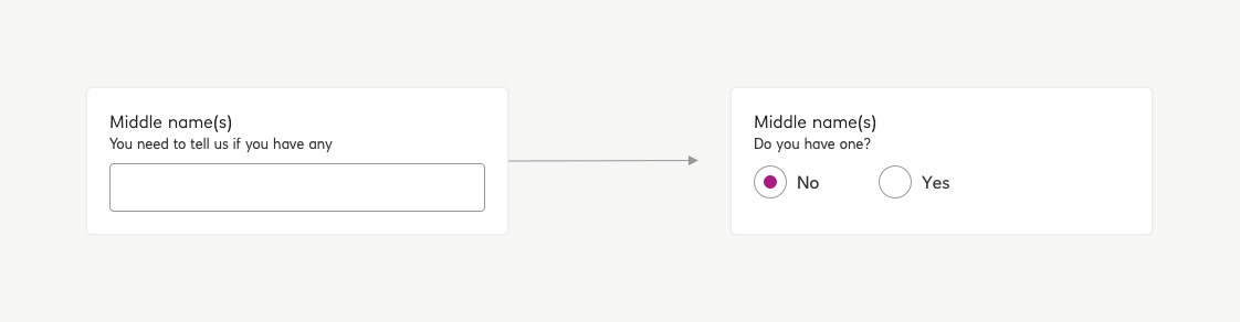
We implemented a very simple piece of UI to solve this, by having users opt in to having a middle name, we could progressively display the text field to avoid needless tabbing back and forth.
What was great about iterating this component was that it wasn't exclusive to the credit card journey and would feed in to the current account and loan applications too.
We can help you to do more with digital
Your targets are our targets. We approach every project with empathy, creative thinking and a focus on user experience.
Lessons learned
Whilst trying to cut down on development time and ensure consistency, it became apparent very quickly that there is no one size fits all approach when users are applying for different kinds of financial products. With the credit card application especially, there needs to be a high degree of empathy when considering why people require credit. These types of products are completely different from savings accounts, current accounts and loans and so is the mindset of the people applying.
Analytical data only tells so much of the story but unfortunately it is a very dehumanised story and doesn't put people first. While the numbers may be in black and white, it is very easy to skew this information in a manner to suit an agenda and it was a good lesson to learn for future projects.
Conclusion
The credit card application was a long and at times, difficult, project. The team that worked on this stuck to our guns and introduced design thinking into other areas of the bank that were used to working in different ways.
We challenged assumptions and made decisions to make the product better for people and I was delighted to learn that the changes we made contributed to a 12% uplift in applications and a 10% rise in approvals.
Get in touch to see if we can apply some creative thinking to your product line.